Potters Without Kilns
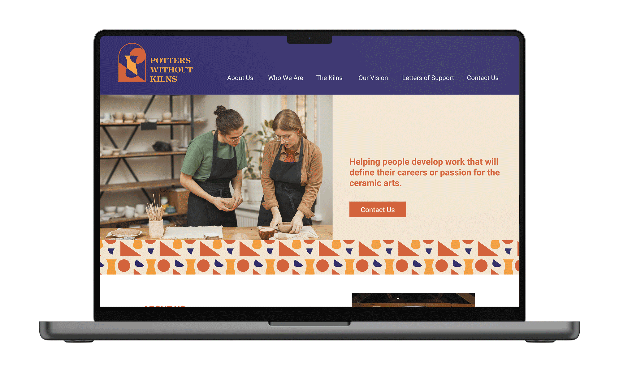
Potters Without Kilns is an establishment that provides people who love pottery access to their studio and kilns. They needed a new logo, brand identity, palette, photo style, website, and any extras.
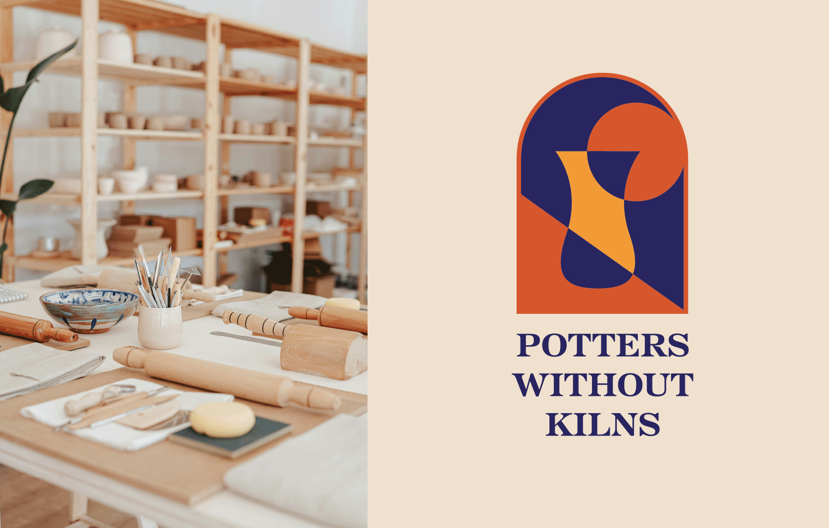
The new logo is a modern and simplified version of their old logo which I decided to break up into geometric shapes to form a pottery vase in the middle of a kiln. I decided on a vibrant color palette with warm colors like a kiln fire and used a dark purple for contrast that makes the warm colors pop.
I made a playful pattern out of the shapes from the logo. This created an interesting visual that can be placed on stationary and merchandise and made the brand feel more professional, inviting, and inspiring for artists.


I updated their digital presence by selecting a photo style that highlights the artists and people who create and work in the space. I utilized a half-arch shape from the logo which resembles a kiln as a unique container for images and buttons as an extra element to reinforce the brand identity.